Monasticism and Typesetting at the Dick Kouwenhoven Book Arts Studio
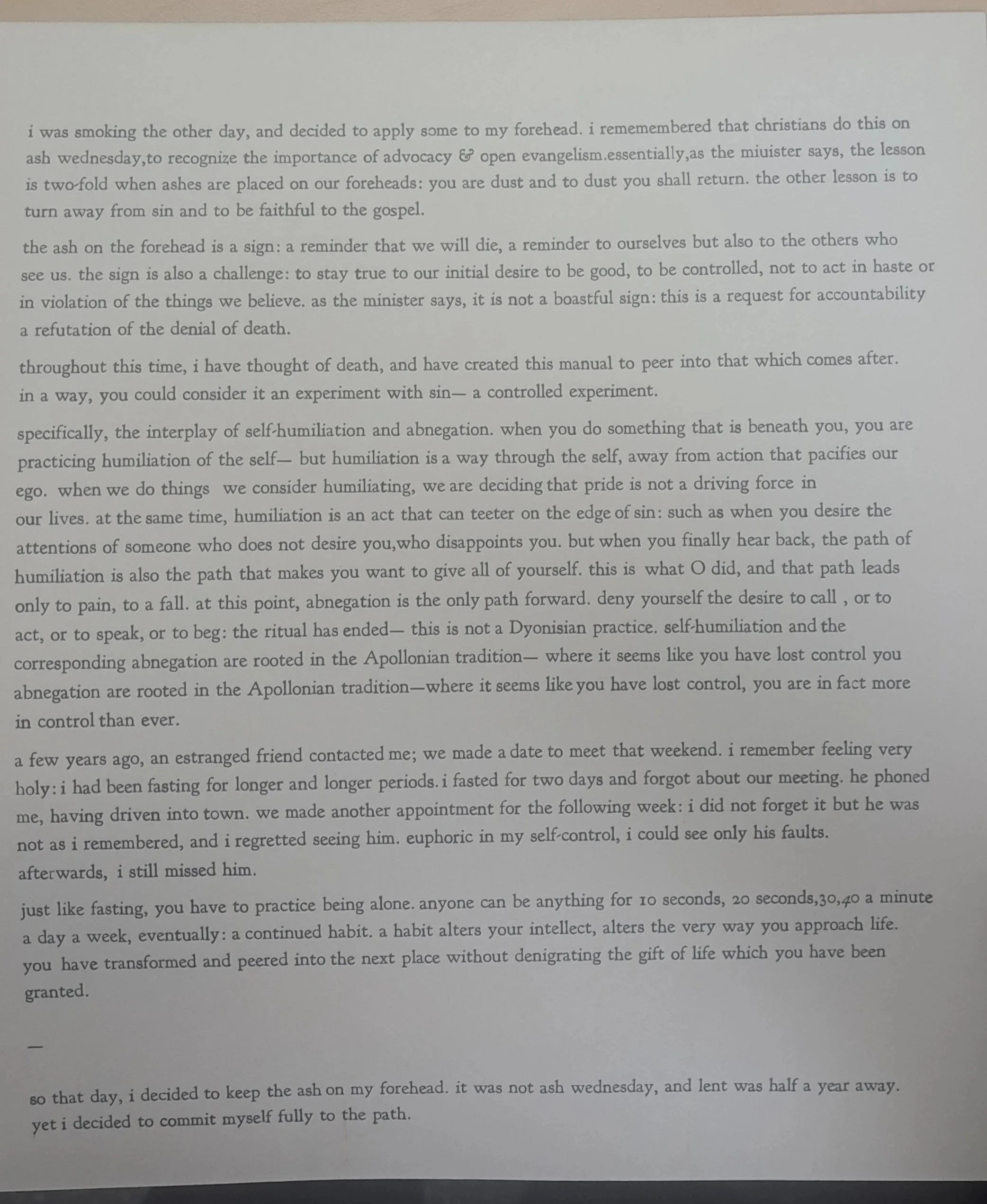
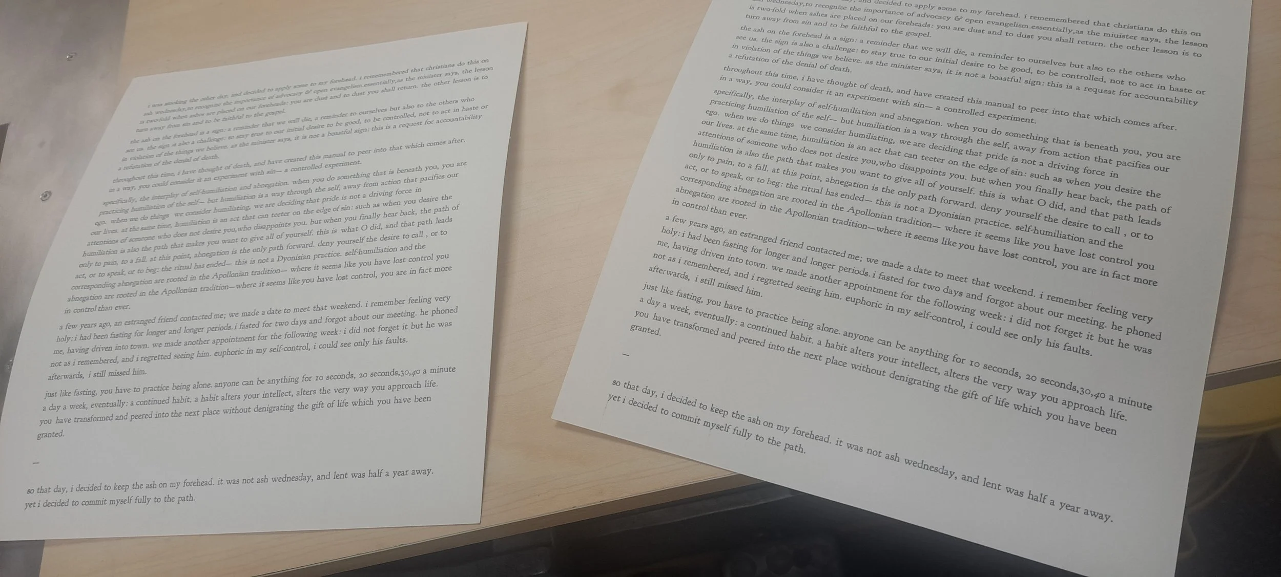
I spent several months typesetting a 600 word introduction to Violette entitled “Experimenting with Sin”. “Experimenting” was a true exercise in monasticism: typesetting forces you to address whether each word is truly necessary; and forces you to answer whether removing words is done out of necessity or growing fatigue and laziness over the process. Typesetting is already a long endeavour: limited resources and budget cuts at Simon Fraser University also meant I could not visit the studio as often as I would like.
I began setting the type in June 2025, and printed everything in November 2025.
When you finish a typesetting project, there is also a final step called “dissing the type”, which is where you put each little letter back into its respective place in the California job case. I dissed half my type at the end of November. Due to travel, holidays, and the limited studio resources, as of March 2026 I still haven’t finished dissing!! I will definitely finish before I graduate from SFU.
i documented the process below
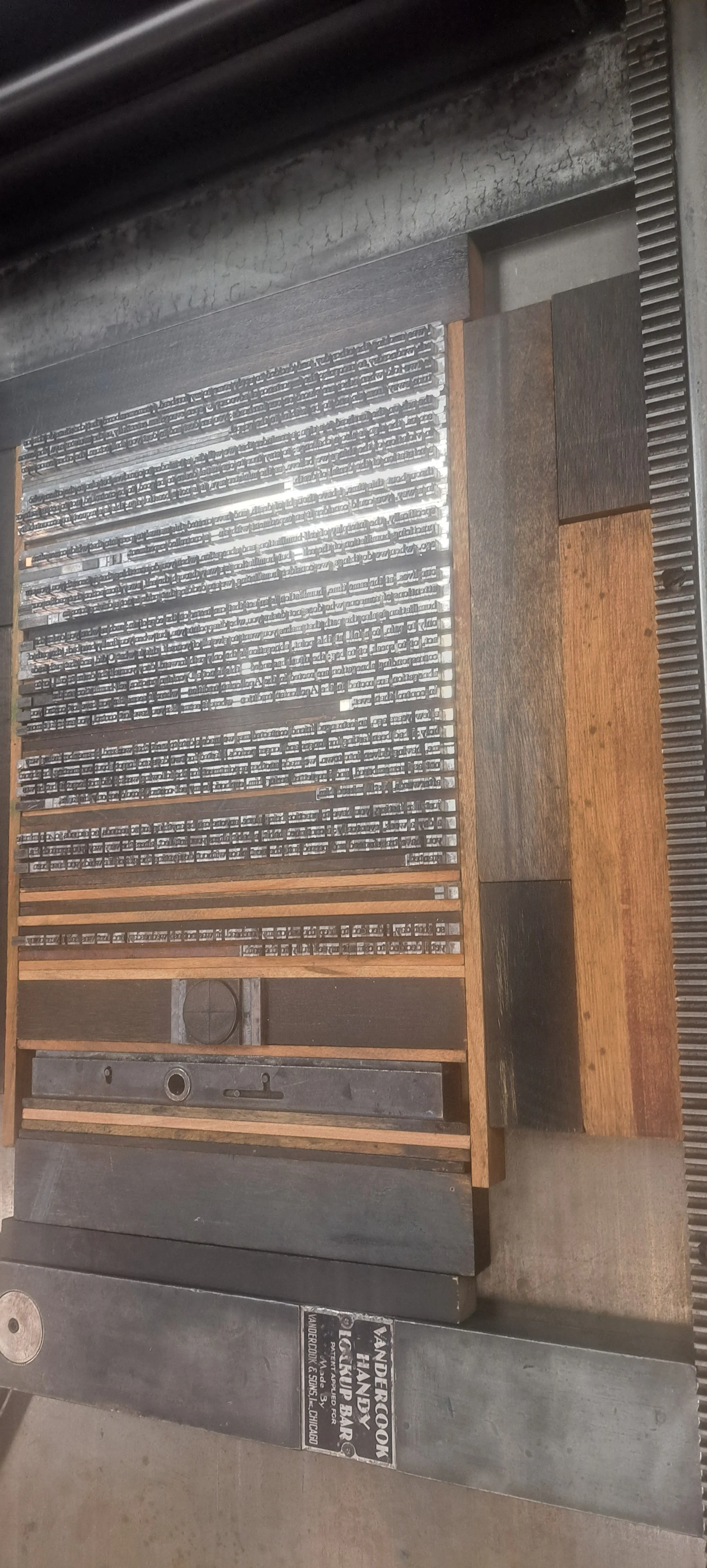
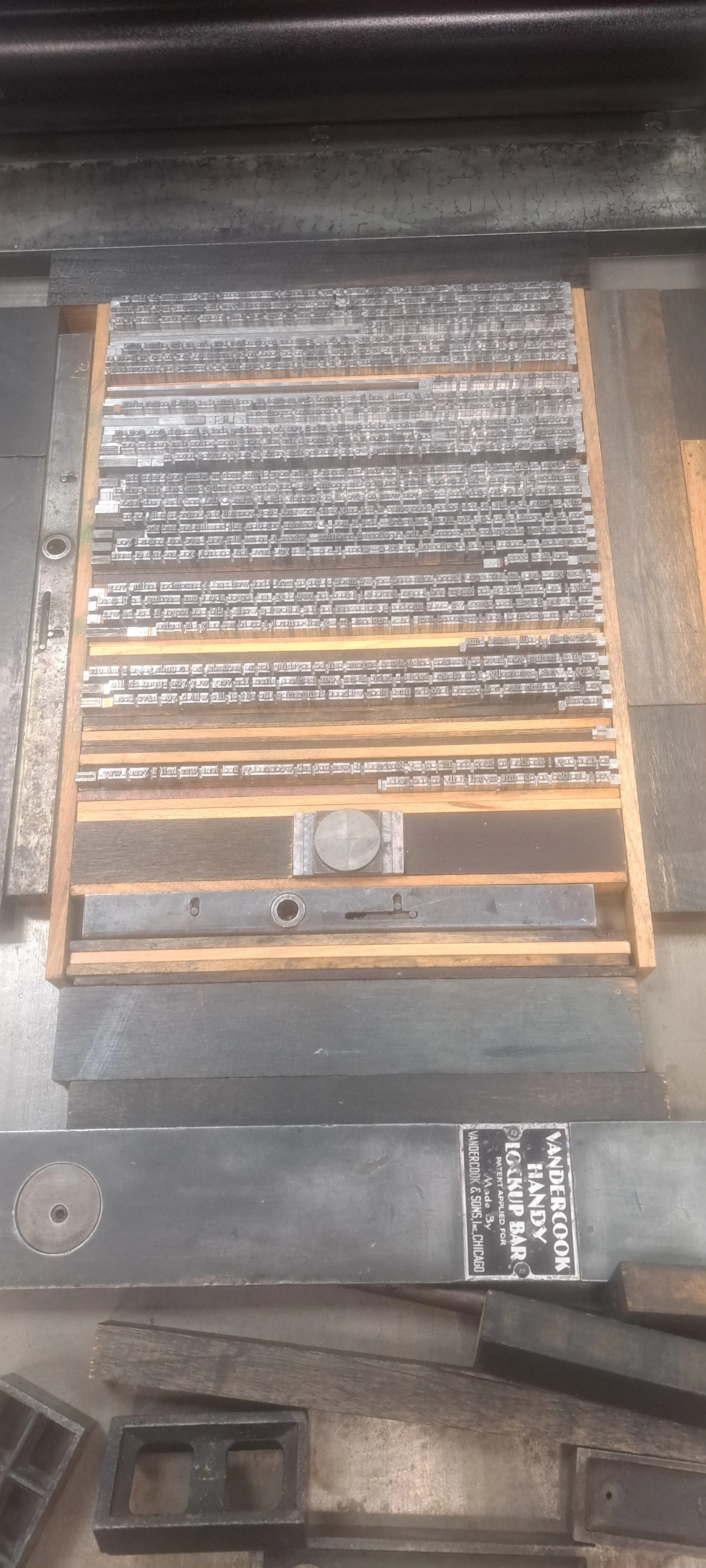
Locking in the chase.
what's happening above?
You typeset on a composing stick, which then forms your galley. Once you move the galley onto the letterpress, it becomes a chase. You can see Andrea setting up the furniture (the lead pieces on the outside of the main text) and locking the whole thing up with quoins and a key. This took a lot of fiddling with because I made a lot of beginner errors during the typesetting.
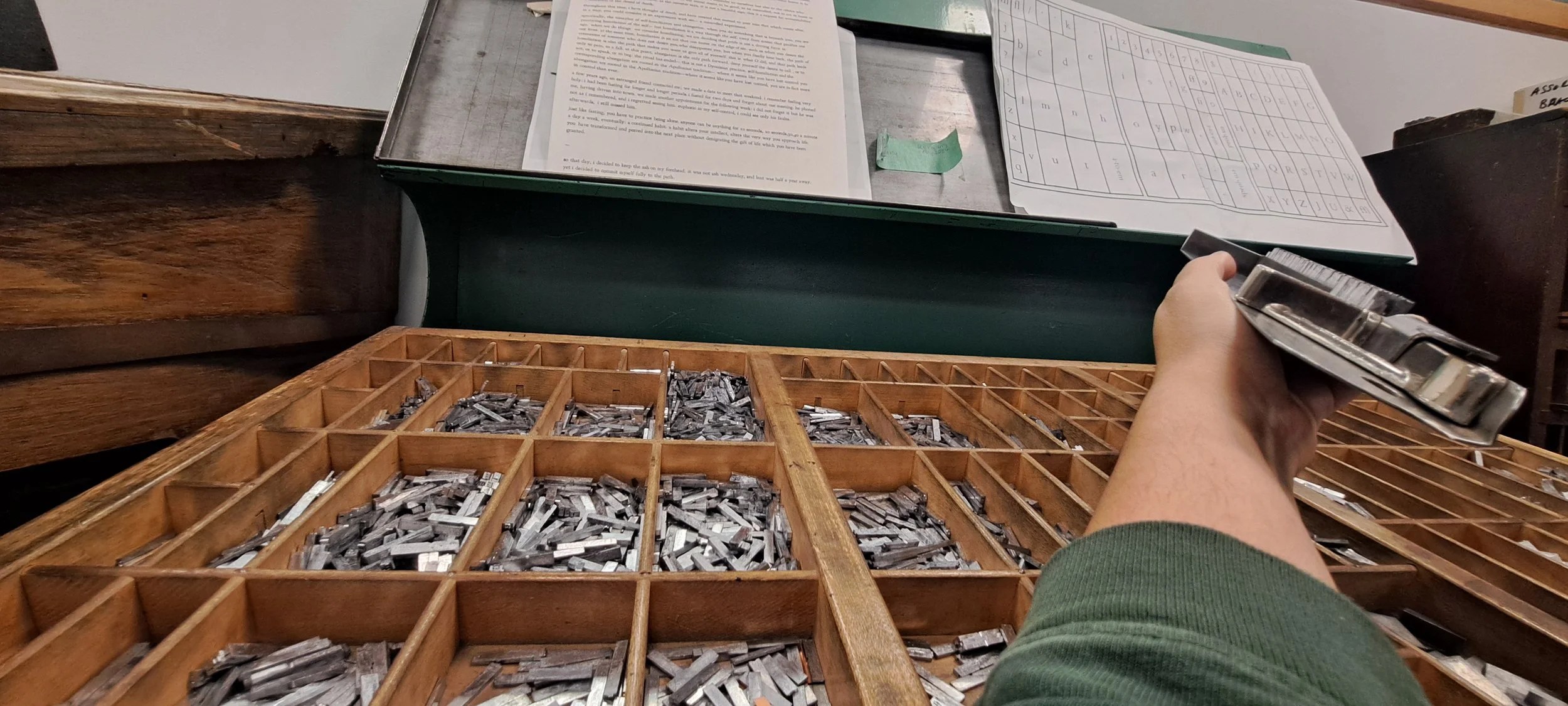
What are we doing with our hands? We’re checking to see how loose each piece of type is—if they’re too loose, then we won’t print properly. They might buckle out. I made so many mistakes. Soooo many. We had to fill in the loose spaces with spacers, some of which were so tiny.
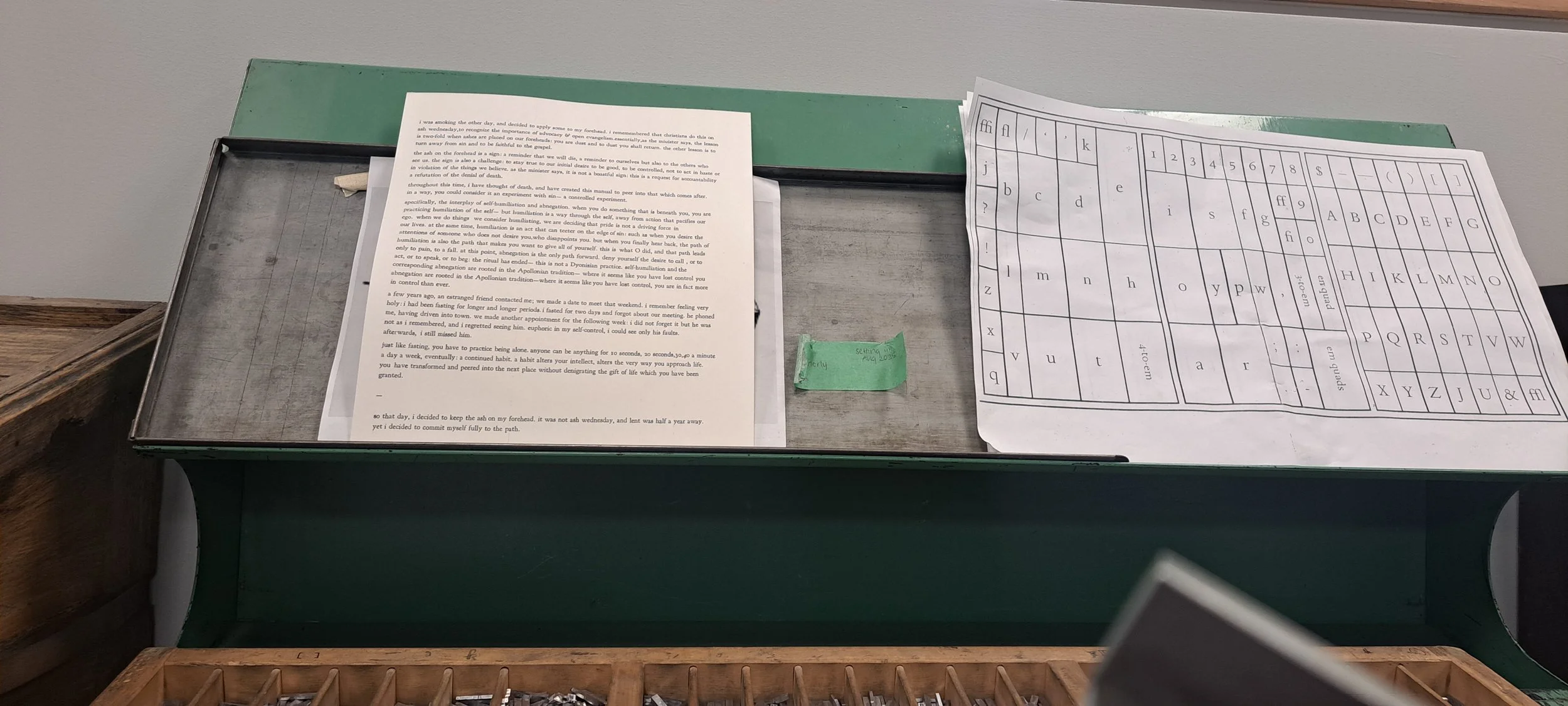
what's happening below?
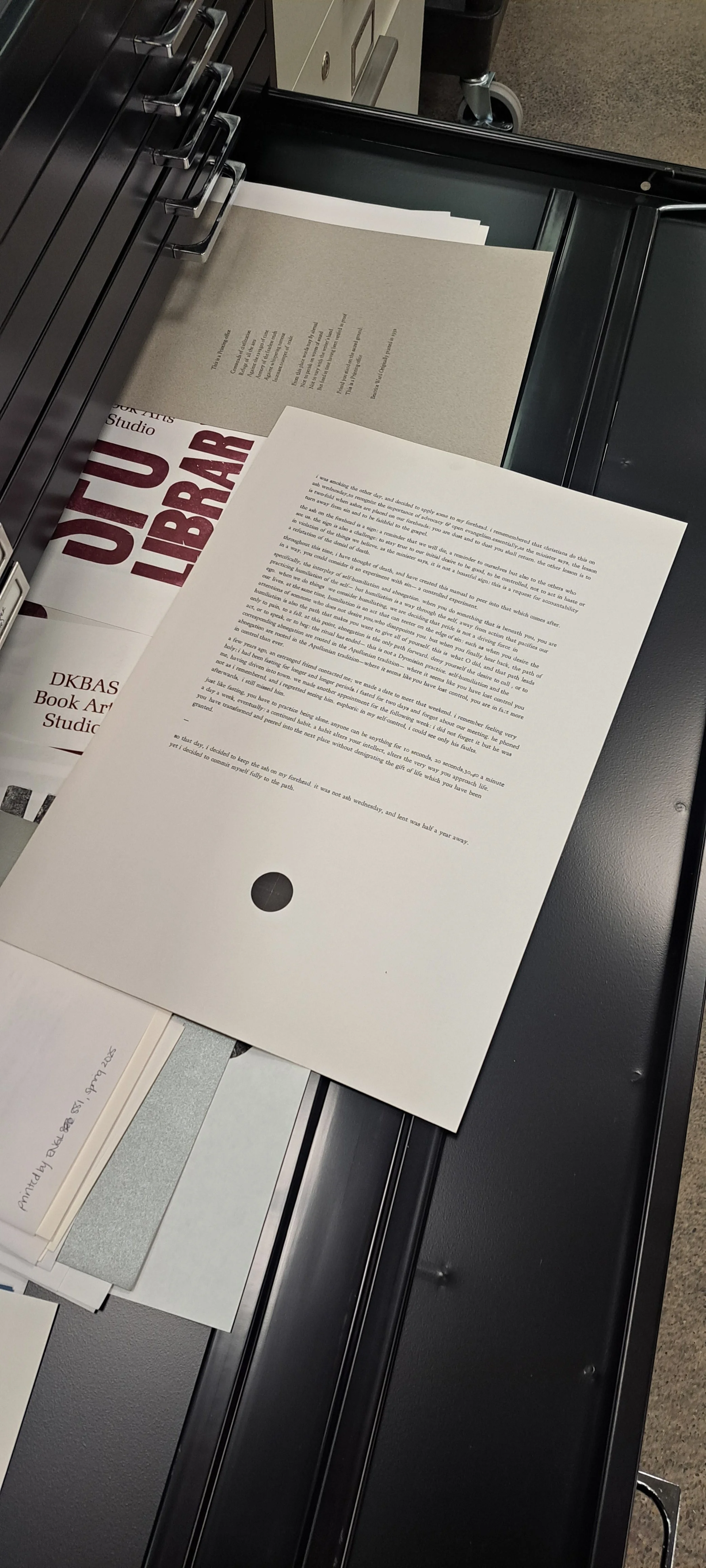
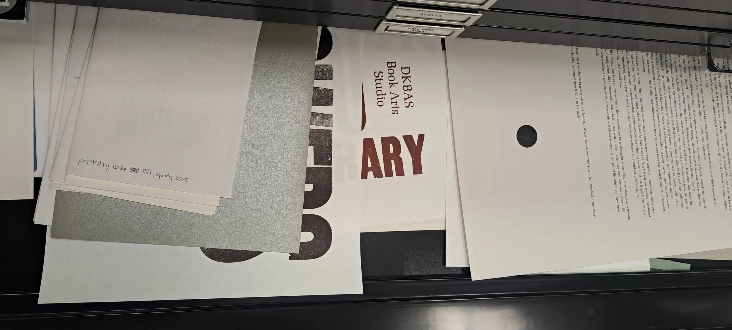
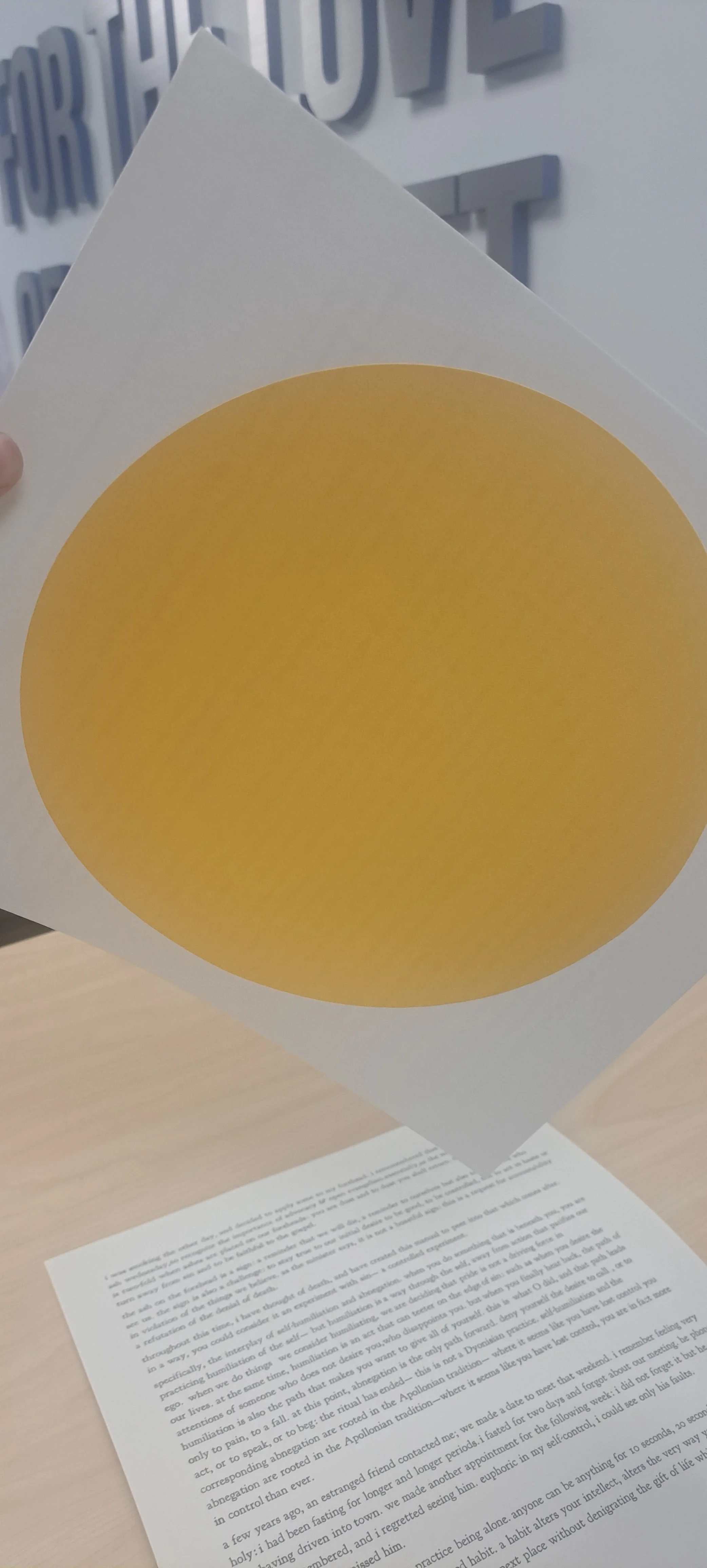
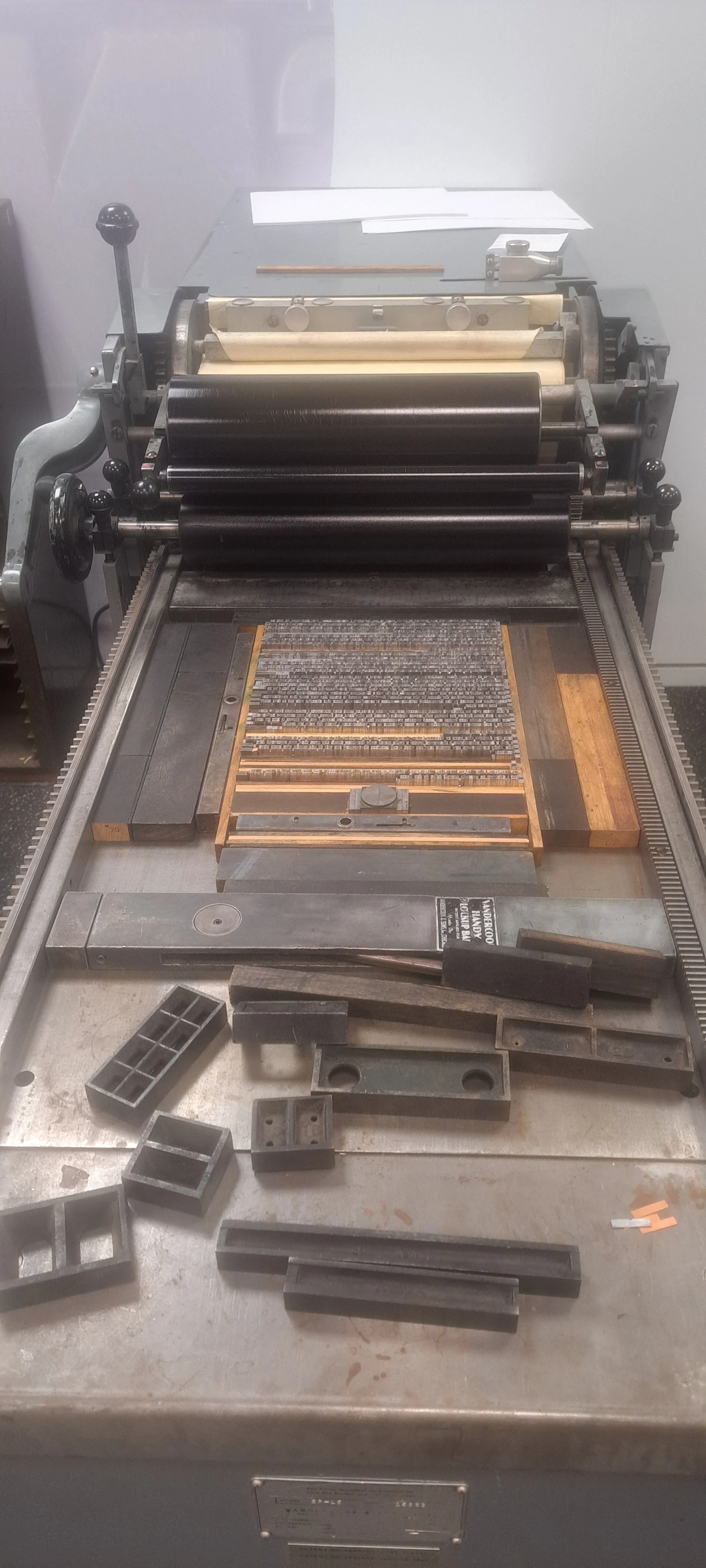
After locking everything up nicely, we ink the sheet and set it up for the first test print! Scroll below the video for a gallery of the finished product: I printed on two different types of paper, a thick paper with a yellow circle on the back (wherein I omitted the circular signature that you can see on the longer cream version).
Ink it up and print already!!
I was inspired to begin this typesetting project by the many broadsides within the Feral Archive. As I explain on the project page, there are actually three catalogues: 1) what I initially catalogued, 2) issues which were gifted to me for my service on the first catalogue, and 3) the catalogue that composes the Feral Archive.
James gifted me several beautiful broadsides; one stood out to me after typesetting “Experimenting with sin”: a broadside by Norm Sibum, designed by Robert Bringhurst, and sold by William Hoffer. The broadside itself is taped inside a book that is covered in something like burlap. It is soft, pleasant to touch. When you open it, a soft orange welcomes you, and the broadside is on the right-hand side. The paper is protected, holy.
After printing eighteen copies, I understood the function behind this design. The outcome of my monastic practice requires a consecration.